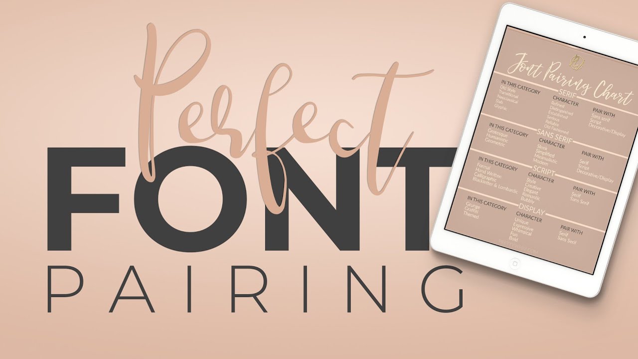
In the captivating world of design, every element works in concert to tell a story, evoke emotions, and leave a lasting impression. Amongst these elements, fonts emerge as powerful allies, shaping the tone, hierarchy, and visual impact of your work. However, wielding the power of fonts effectively requires mastering the art of font pairing, a delicate dance of contrast and cohesion that elevates your designs to the next level.
The Magic of Contrast: Building Visual Interest through Dissonance
Think of two harmonious notes played simultaneously – a deep bass and a soaring flute. Their contrasting tones, when combined, create a beautiful melody. Similarly, effective font pairing relies on strategic contrast to draw attention and guide the eye. Consider pairing a bold, dynamic sans-serif headline with a clean, traditional serif body text. The stark contrast instantly grabs attention, highlighting the headline’s importance while offering a comfortable reading experience for the text below.
Finding Unity in Diversity: Bridging the Gap with Shared Qualities
While contrast grabs attention, cohesion ensures balance and harmony. Look for subtle connections between your chosen fonts, even amidst their differences. Perhaps they share similar x-heights, creating a visual link across sizes. Or maybe they both display elegant curves in their letterforms, hinting at a shared personality. These shared qualities, like unspoken whispers, bind the fonts together, preventing them from clashing and creating a unified visual composition.
Hierarchy Defined: Using Fonts to Guide the Eye
In design, hierarchy directs the viewer’s gaze, prioritizing information and establishing a clear flow. Fonts and typeface play a crucial role in this process. A larger, bolder typeface used for a heading naturally draws the eye first, while a smaller, lighter font might be used for subheadings or body text. This hierarchy of size and weight guides the reader through the content, ensuring they encounter information in the intended order.
Personality Through Pairing: Matching Fonts to Mood and Tone
Fonts, like chameleon-like beings, can adapt their personalities to suit the occasion. A playful script font might inject a whimsical touch into a children’s book illustration, while a stark sans-serif might evoke a sense of authority and modernity in a corporate brochure. Understanding the mood and tone you wish to convey in your design is key to choosing fonts that resonate with your message and connect with your audience on an emotional level.
Tools and Resources: Finding Your Perfect Match
Navigating the vast ocean of fonts can be daunting, but fear not! Online tools like Adobe Typekit’s “Pair” feature or websites like Typewolf offer curated font pairings for inspiration. Experiment with different combinations, and don’t be afraid to utilize resources like Google Fonts to test and compare options before committing.
Beyond the Rules: Embracing Experimentation and Personal Style
While established principles provide a valuable foundation, the true beauty of font pairing lies in the freedom to experiment and break the rules. Trust your instincts, explore unexpected combinations, and let your personal style guide your choices. You might discover hidden gems that defy convention and redefine the boundaries of successful font pairing.
From discordant notes to a resounding melody, mastering the art of font pairing transforms your designs from mere arrangements of text into captivating visual experiences. By understanding the power of contrast, cohesion, hierarchy, and personality, you can wield fonts as powerful tools to tell your story, engage your audience, and leave a lasting impression in the ever-evolving landscape of design.

